In the rapidly evolving world of design systems and digital product development, design tokens have become a foundational element for ensuring consistency, scalability, and efficiency across platforms. Whether you’re a designer striving for visual harmony or a developer implementing interfaces across multiple codebases, understanding and utilizing design tokens can significantly improve your workflow and product quality.
In this article, we’ll explore what design tokens are, why they matter, and how to effectively use them in modern workflows — with practical tools, examples, and best practices.
What Are Design Tokens?
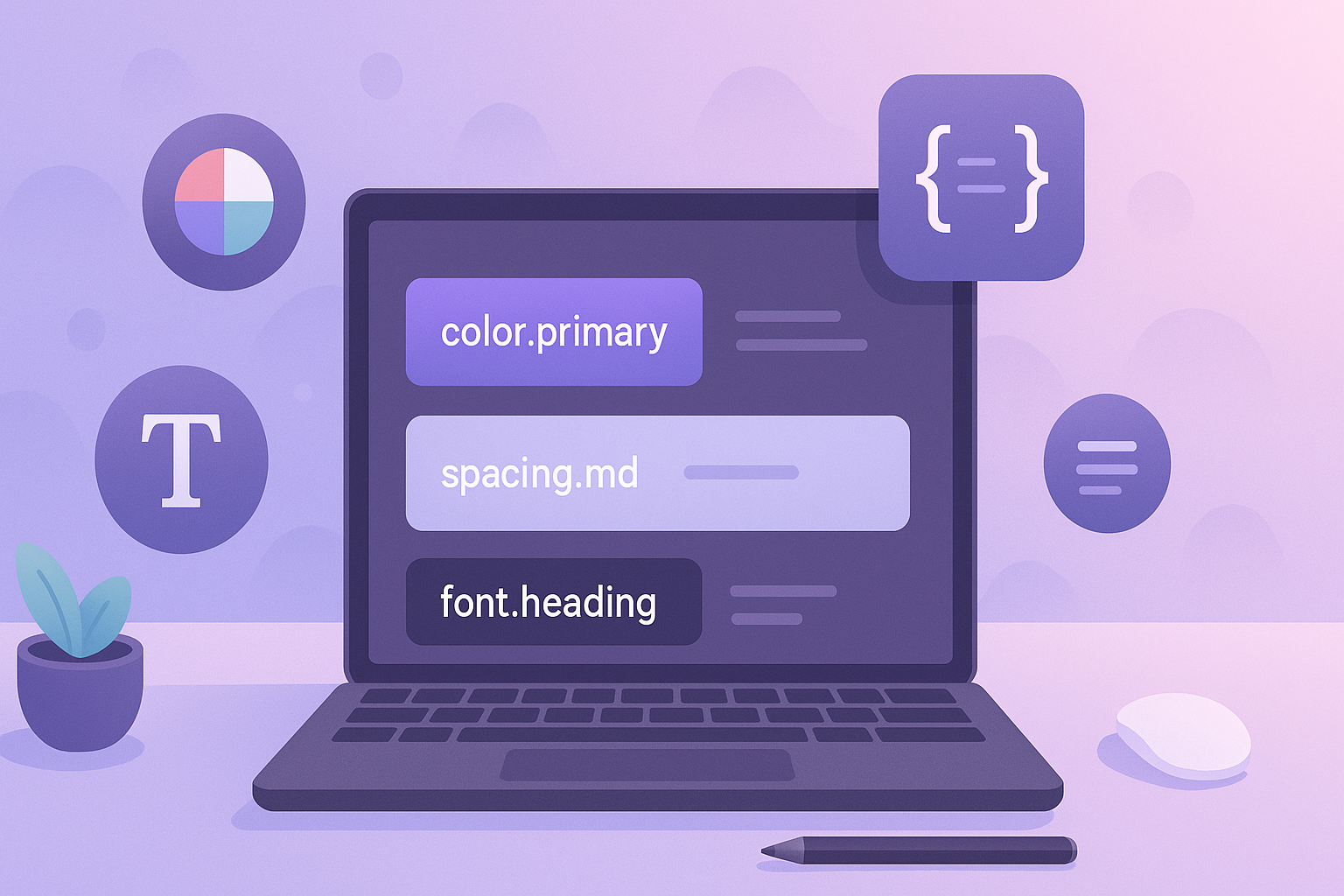
At their core, design tokens are the visual values of a design system — stored as variables — that can be used across platforms and tools.
Think of them like variables in code, but for design elements. Instead of hardcoding a color like #1E90FF in multiple places, you use a token like color.primary. This token is stored in a central system and referenced wherever needed — in design tools, code, or documentation.
Common Types of Design Tokens:
- Color Tokens:
color.primary,color.background,color.text.secondary - Spacing Tokens:
spacing.xs,spacing.md,spacing.lg - Typography Tokens:
font.heading,font.body,lineHeight.tight - Shadow Tokens:
shadow.card,shadow.button - Border Radius Tokens:
radius.sm,radius.lg
Example: JSON Representation
{
  "color": {
    "primary": "#1E90FF",
    "secondary": "#FF6347",
    "background": "#FFFFFF"
  },
  "spacing": {
    "sm": "8px",
    "md": "16px",
    "lg": "24px"
  }
}
Example: CSS Custom Properties
:root {
  --color-primary: #1E90FF;
  --spacing-md: 16px;
  --font-heading: 'Inter', sans-serif;
}
Why Use Design Tokens?
Design tokens solve a fundamental problem: how to maintain visual and functional consistency across design and code, at scale.
Key Benefits:
- Consistency Across Platforms: Whether you’re building for web, iOS, Android, or desktop, the same token ensures the same value.
- Efficiency in Updates: Change a token value once (e.g., primary color) and it reflects everywhere — saving hours of repetitive updates.
- Better Designer-Developer Handoff: Tokens serve as a shared language between design and code.
- Scalability: Ideal for growing teams and evolving products with multi-brand or theming support.
- Accessibility: Tokens can embed accessibility principles like color contrast directly into the design foundation.
Cross-Platform Compatibility
Tokens aren’t platform-bound. Tools like Style Dictionary allow you to export tokens into multiple formats:
- CSS / SCSS for Web
- XML for Android
- JSON for React Native
- Swift for iOS
How to Use Design Tokens
Implementing design tokens involves setting them up in your design system, syncing them with your codebase, and using proper tools for automation.
Step-by-Step Workflow:
- Define Tokens in Design
- Use tools like Figma Tokens Plugin or Tokens Studio to set token values.
- Organize Tokens by Category
- e.g.,
color,typography,spacing,shadows,radii, etc.
- e.g.,
- Export Tokens for Development
- Use tools like Style Dictionary, Token Transformer, or GitHub Actions.
- Integrate in Code
- Reference tokens via CSS variables, SCSS variables, Tailwind config, or JSON.
Popular Tools for Design Tokens:
- Figma Tokens Plugin – Create and manage tokens inside Figma.
- Style Dictionary – Export tokens into platform-specific formats.
- Tokens Studio – Token management and syncing for Figma & dev workflows.
- Theo – Another design token transform library (Salesforce).
Example Integration in SCSS
$color-primary: var(--color-primary);
.button {
  background-color: $color-primary;
  padding: var(--spacing-md);
}
Design Tokens in Action
Let’s say your brand’s primary color is #0066FF. Instead of hardcoding that color into dozens of components, you define:
"color": {
  "primary": "#0066FF"
}
Now your design tool, website styles, mobile apps, and design documentation all reference this single source of truth. If marketing wants to change the brand blue to #0044CC, you update the token once — and it cascades everywhere.
Case Example: Shopify Polaris
Shopify uses tokens heavily in their Polaris design system. They define spacing, colors, motion, and accessibility rules using tokens — allowing for brand consistency across apps, themes, and third-party extensions.
Best Practices & Tips
To get the most out of design tokens, follow these best practices:
1. Use Clear Naming Conventions
- Use structured naming like:
color.text.primary,spacing.xl,font.size.heading - Avoid ambiguous names like
color1,blue, orpadding1
2. Structure Tokens Hierarchically
Group tokens logically for maintainability:
"spacing": {
  "xs": "4px",
  "sm": "8px",
  "md": "16px",
  "lg": "24px"
}
3. Sync Between Design & Code
Use plugins and automation tools to keep tokens in sync.
No more “redesign in Figma but forgot to update the code” headaches.
4. Use Alias Tokens Where Needed
Define base tokens (e.g., color.brand) and alias them for use cases like button.background.
Conclusion: Why Design Tokens Matter in 2025 and Beyond
As product ecosystems become more complex and design systems grow more sophisticated, design tokens are no longer optional — they are essential. They streamline the bridge between design and development, promote visual harmony, and allow for scalable, maintainable UI systems.
Whether you’re building your first design system or scaling one across multiple teams and platforms, design tokens offer a single source of truth for your UI language — making your work faster, smarter, and more consistent.
Start small. Think modular. Build scalable.
Embrace design tokens now — your future self (and your team) will thank you.